The brief said "website." The problem said something else.
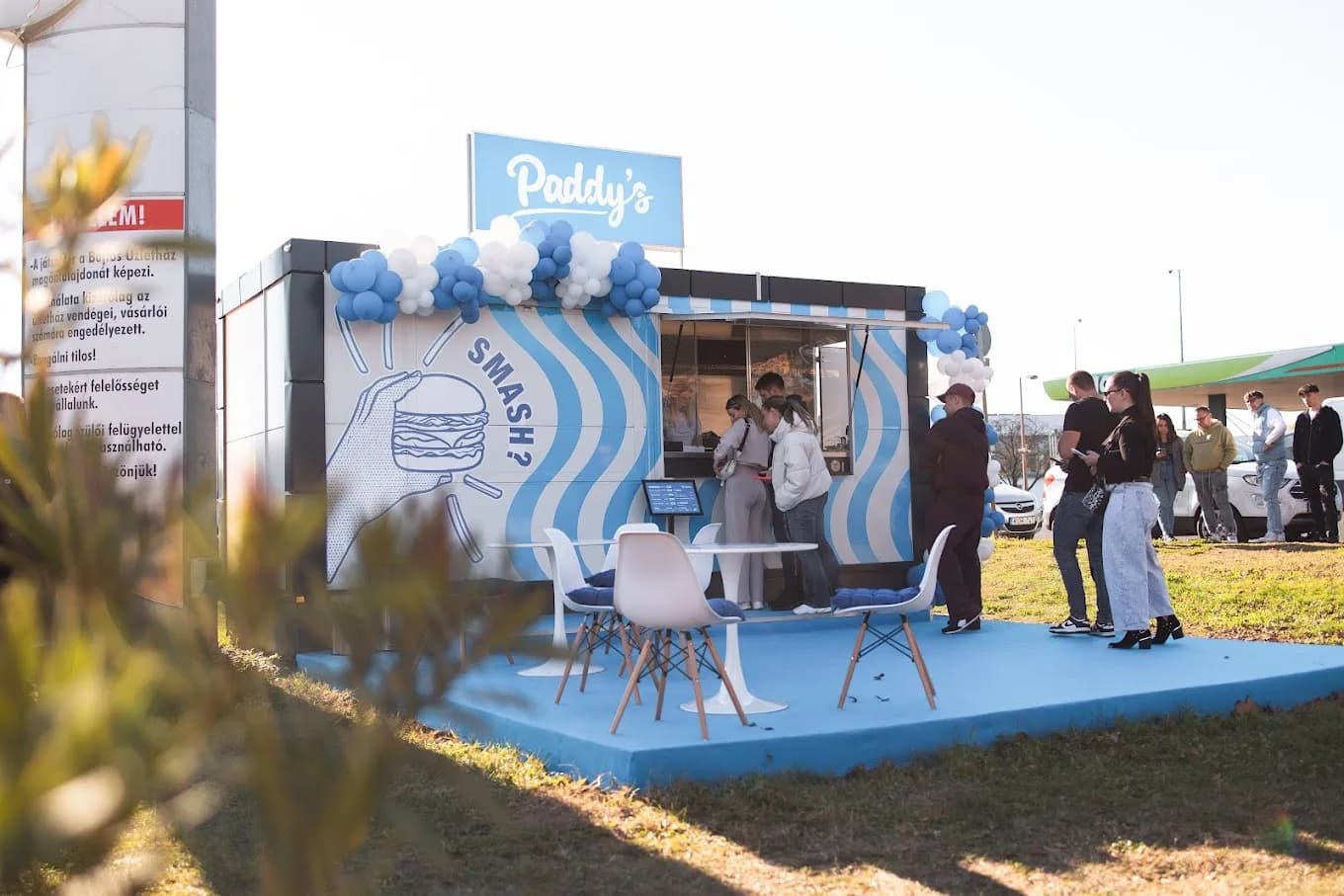
Paddy's Burger is a smash burger restaurant in Nyíregyháza with a growing local following. Delivery ran through Wolt and Foodora, which handled that side well. But for in-store pickup, the restaurant had no digital channel at all. No way to take orders ahead of time. No direct customer relationships. No email addresses. No order history. No way to reward regulars.
A landing page would have satisfied the brief, but it wouldn't have touched the actual problem.
What I actually built
Four systems, one codebase:
- A pre-order flow that gives the restaurant a direct channel for in-store pickup orders.
- A loyalty program where returning customers earn points and redeem rewards via QR codes.
- A staff dashboard that gives the kitchen live visibility into incoming orders.
- A catering module (in development) that opens up a new market: events, offices, bulk orders.
The pre-order and loyalty systems serve existing customers better. Catering expands the audience entirely. Each feature emerged from a real need, not a feature wishlist.
Design decisions
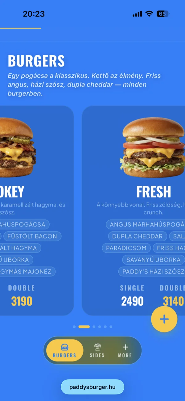
Most food brands default to red, orange, yellow. Paddy's went the opposite direction: a saturated blue that makes the food photography pop through contrast. When every competitor is warm-toned, a cool palette creates instant recognition.
The typography is bold and condensed. Headlines read from a distance on mobile. Body text stays legible without competing with the images. The visual hierarchy does the work: you see the burger first, the name second, the price third.
GSAP handles scroll-triggered animations. Sections reveal on entry, menu items stagger in with 50ms delays, the hero parallaxes subtly. The motion serves a purpose: it directs attention toward the order CTA. Animations run at the same snappy 350ms base duration on all devices. ScrollTrigger thresholds are tuned separately for mobile (80% viewport) and desktop (75%).
Every screen was designed mobile-first. The majority of traffic arrives from social media links tapped on phones.
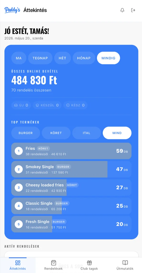
Home page
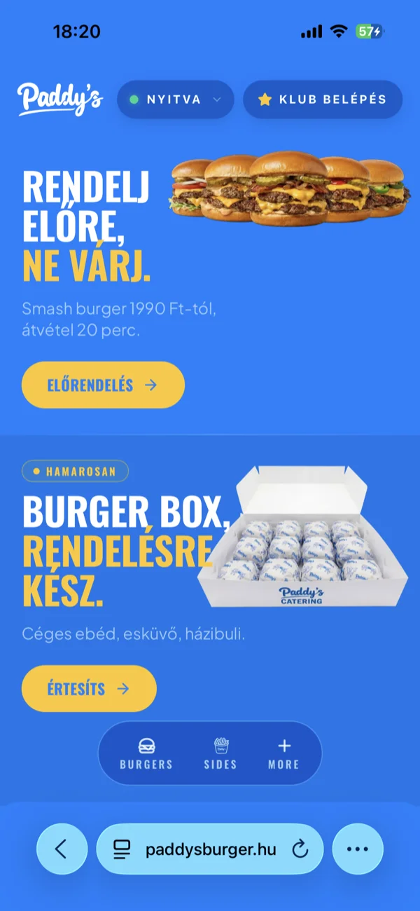
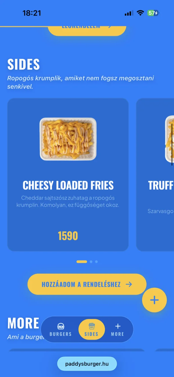
The home page is a single scroll. Hero, menu, loyalty, FAQ, catering: one cool-blue, condensed visual language throughout, every section nudging toward the order button.
No maze of subpages. The guest scrolls down, and by the time they reach the bottom they have seen everything the decision needs: the food, the price, the club, the answers to their questions.
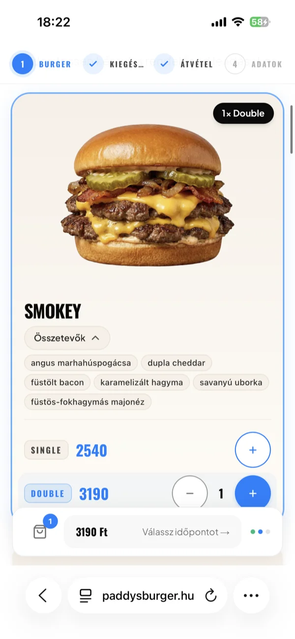
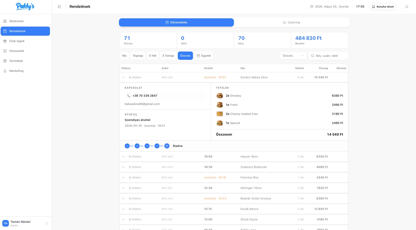
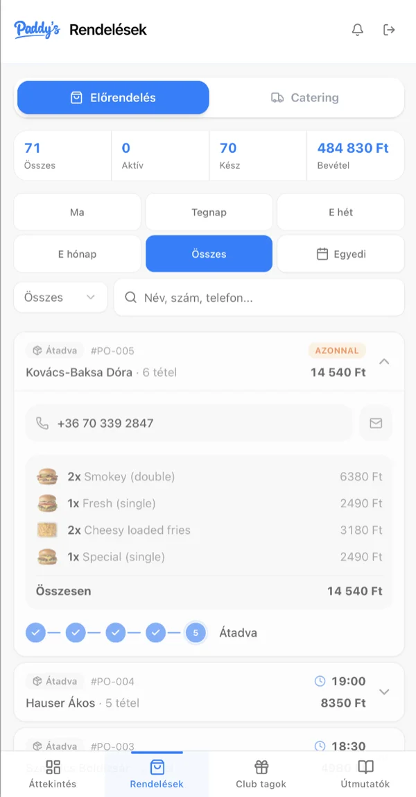
Pre-order system
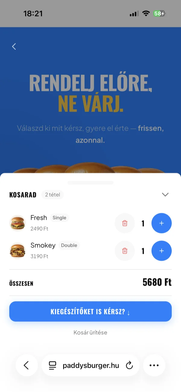
The first instinct was a simple form: name, phone, items, time. But the pattern I kept seeing was the same. Customers order too much at once, pick unrealistic times, and the kitchen has no way to push back.
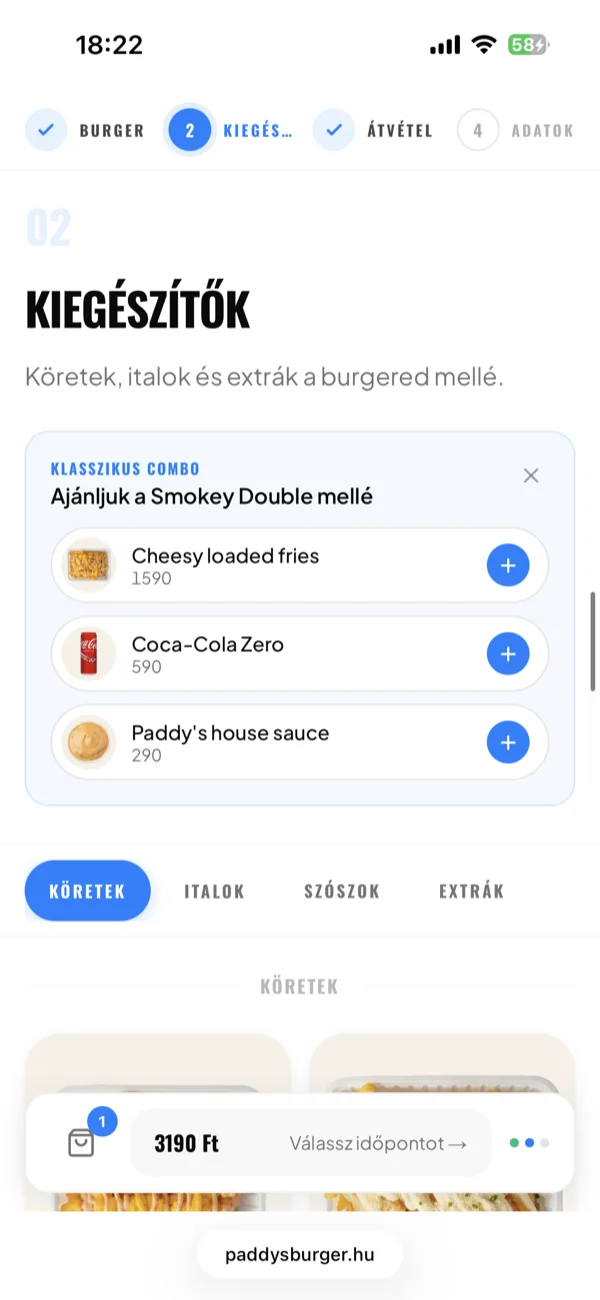
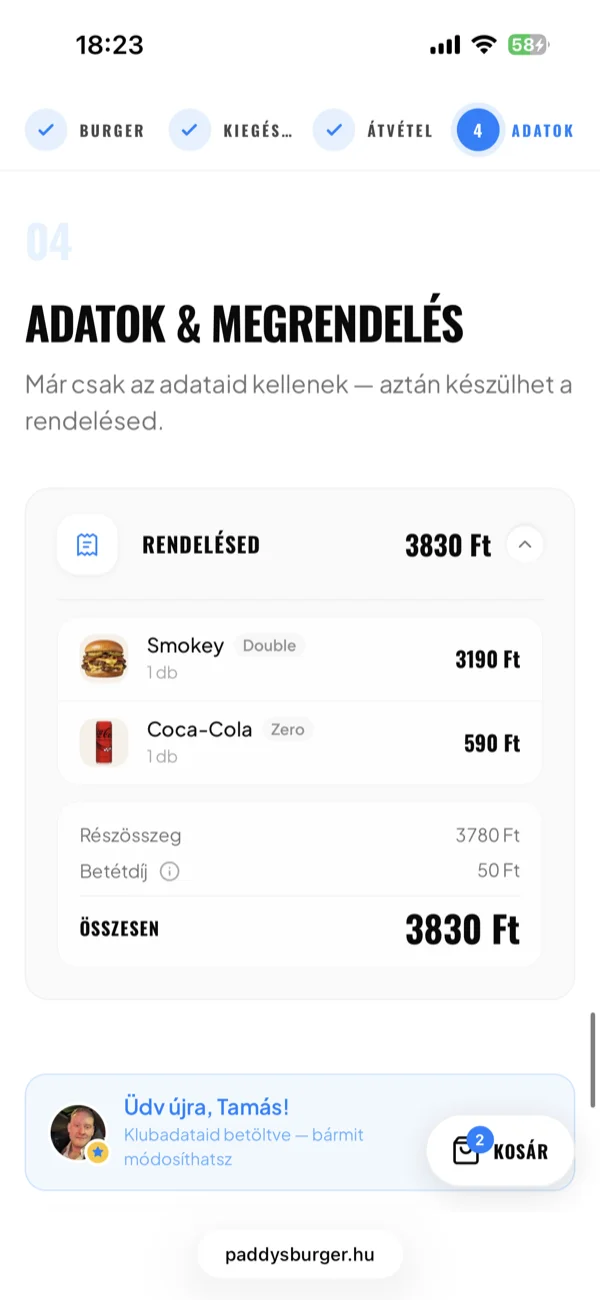
The flow uses progressive disclosure. You pick your burgers first. Add-ons appear only after. Then the pickup time. Then your contact info. Each step narrows the options. The customer never faces a long form, and the kitchen never receives an order it can't fulfill.
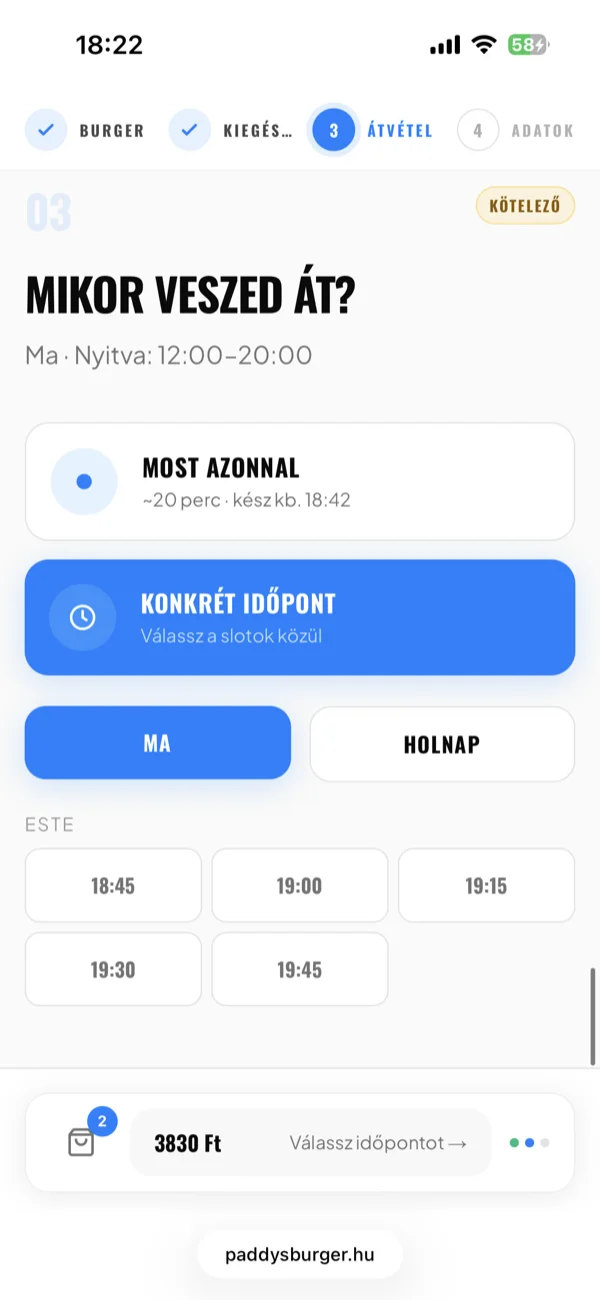
Available pickup times are tied to the restaurant's opening hours, and the system blocks requests outside operating windows.
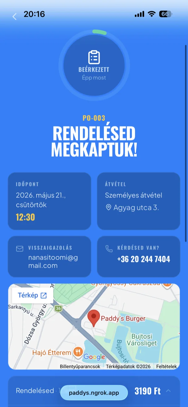
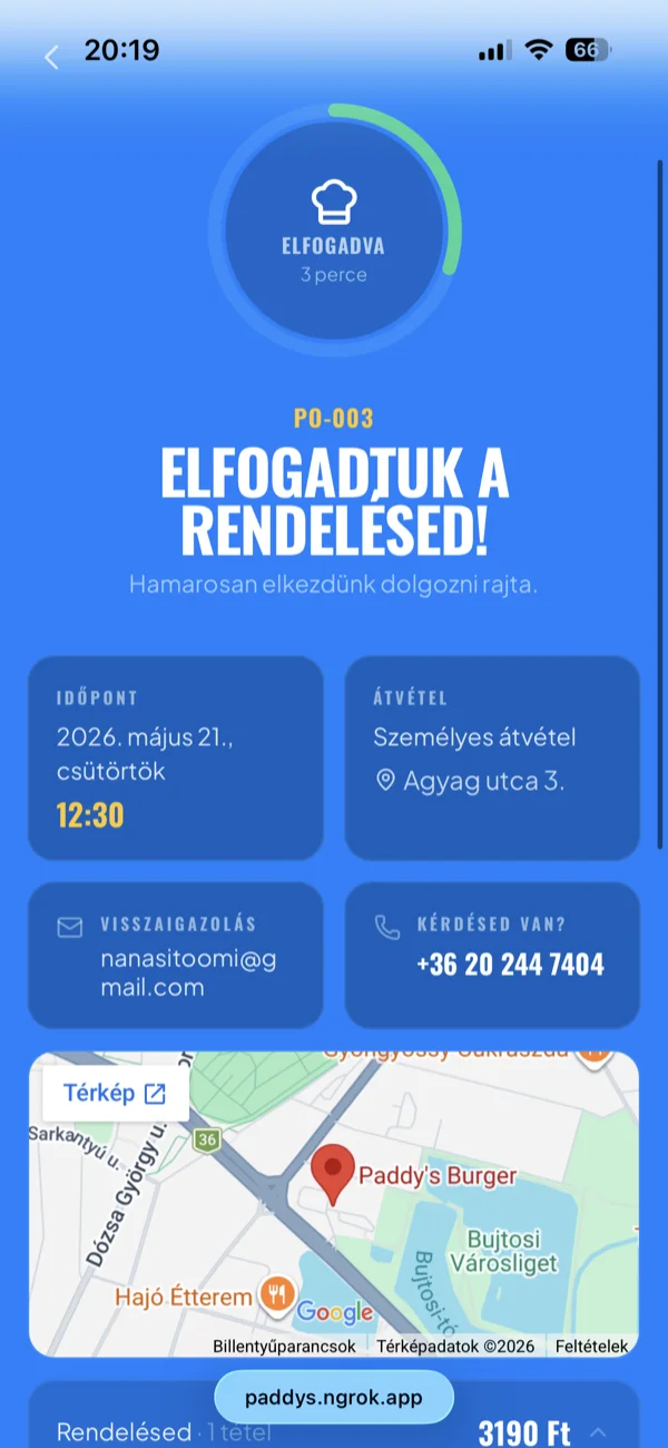
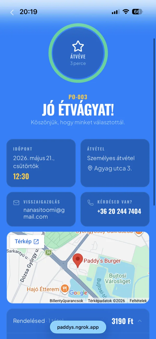
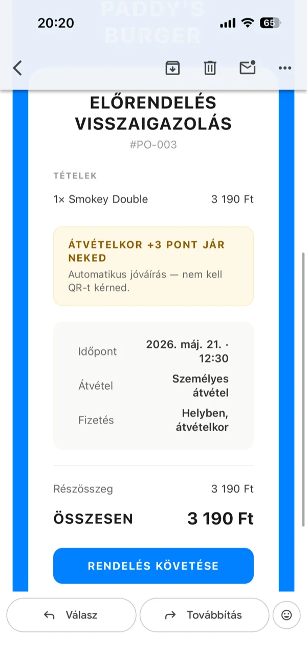
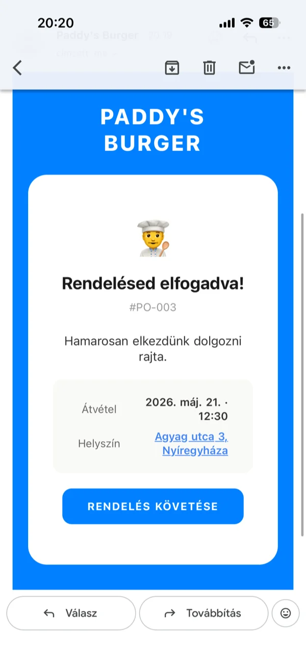
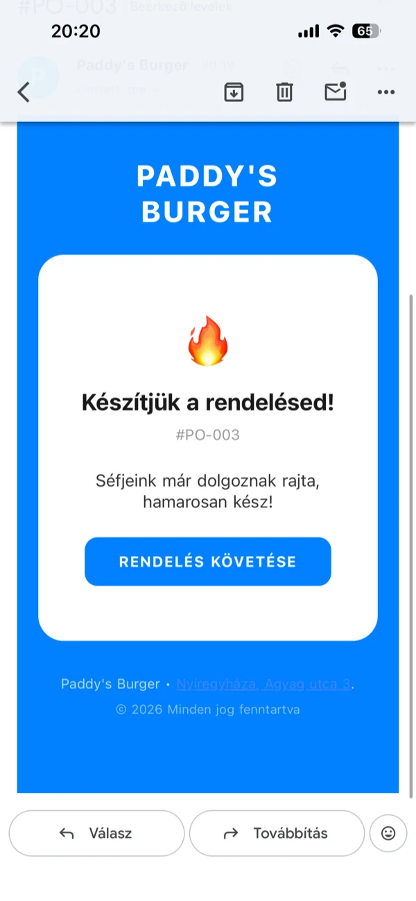
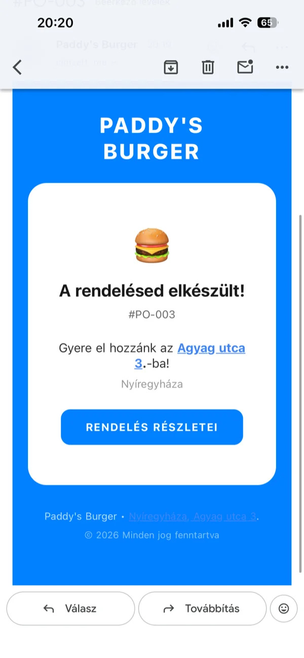
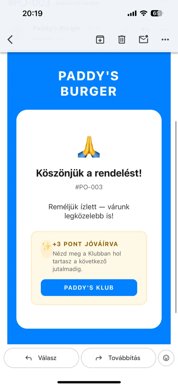
After checkout, the customer lands on a real-time tracking page. A circular progress ring visualizes the five-step journey with perceived progress mapping: the ring jumps to 5% on submission, 30% on acceptance, 65% during preparation, 100% on ready. An elapsed timer shows minutes since the order was placed. The order details expand into a collapsible section with item thumbnails and prices.
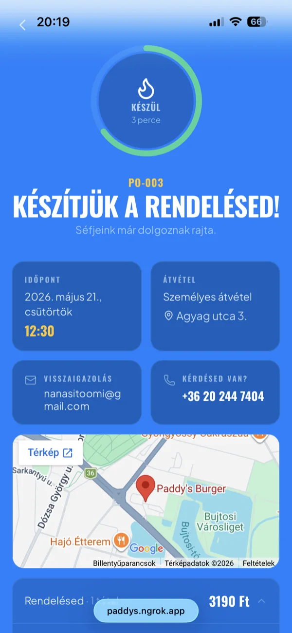
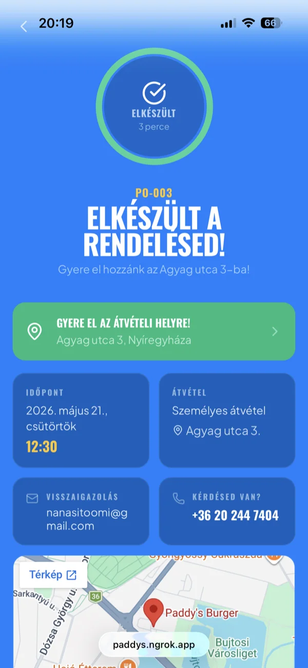
The kitchen gets an instant notification. No phone call needed.
Two details that took longer than expected. The Hungarian deposit return system (DRS) adds 50 HUF per bottled beverage, and the line item has to be visible, separate, and legally correct. Hungarian phone numbers arrive in at least six different formats; the parser normalizes all of them before validation.
Seven automated emails follow the order lifecycle: confirmation with itemized receipt, staff alert with guest details, acceptance notification, preparation update, ready-for-pickup with the restaurant's address and phone, a pickup confirmation with the points credited, and a cancellation message if needed. All templated in React Email, all in Hungarian, all matching the site's visual language.
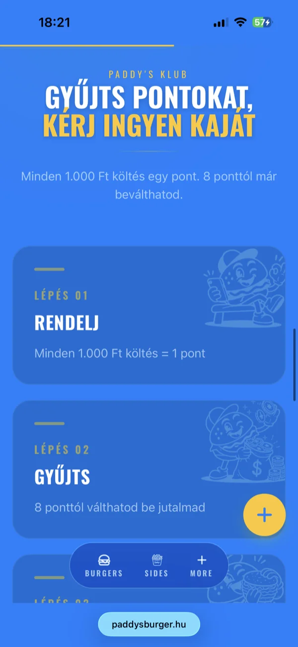
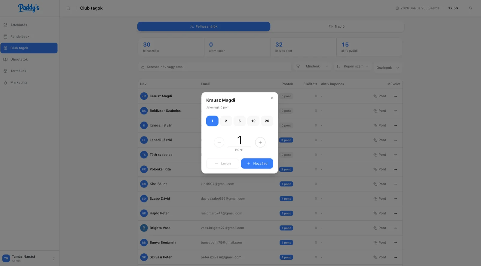
Loyalty program
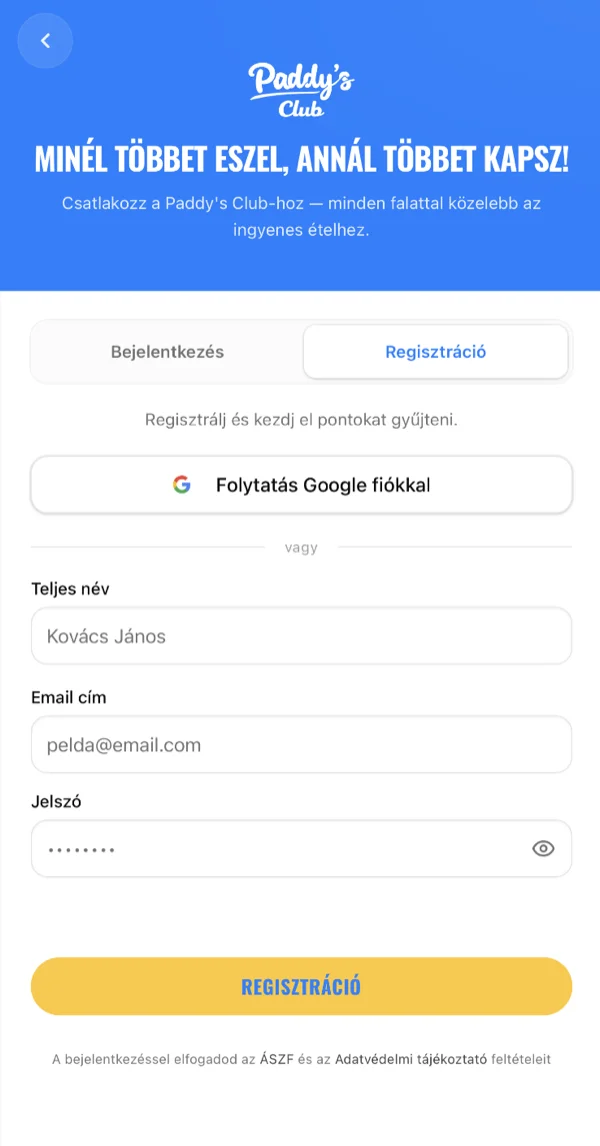
Paper stamp cards get lost. App-based programs have download friction. The middle ground: a web-based points system tied to the user account.
Signup goes through Paddy's Club, with Google OAuth for low friction or email/password as fallback. The login flow includes real-time password validation (8+ characters, mixed case, numbers), an email-based 6-digit OTP code, and progressive lockout against failed attempts: 30 seconds after three failures, one minute after five, five minutes after seven, with a visible countdown timer.
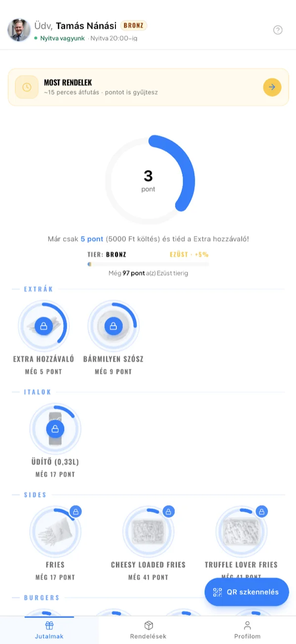
Every order earns points, roughly 1 per 1,000 HUF spent. Ten redeemable rewards, from an extra topping at 8 points to a Smokey Paddy burger at 48. When someone redeems a reward, the system generates a unique QR code valid for 7 days. Staff scan it at the counter. No paper, no forgotten cards, no manual tracking.
The customer sees a radial progress indicator toward their next reward. On redemption: confetti in the brand colors (blue, yellow, green) fires from both sides of the screen. Small details, but they turn a transaction into a habit.
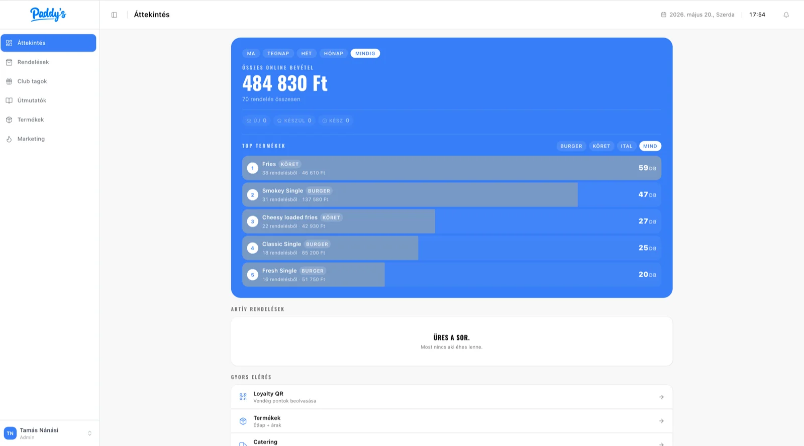
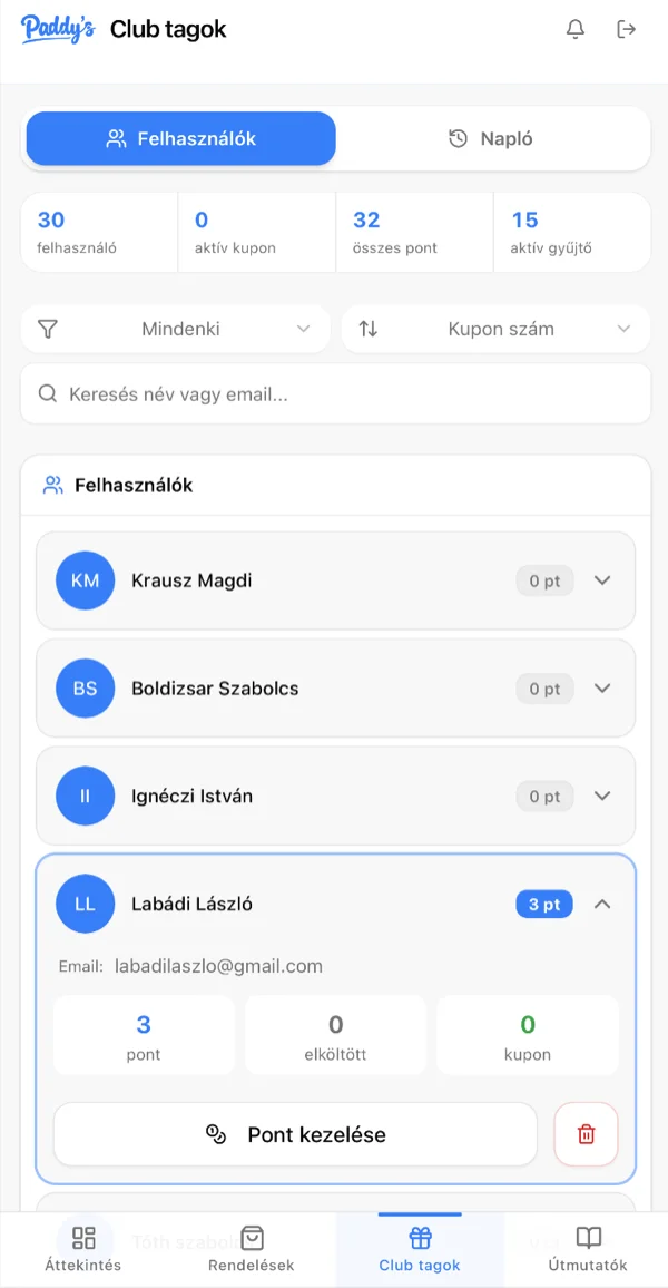
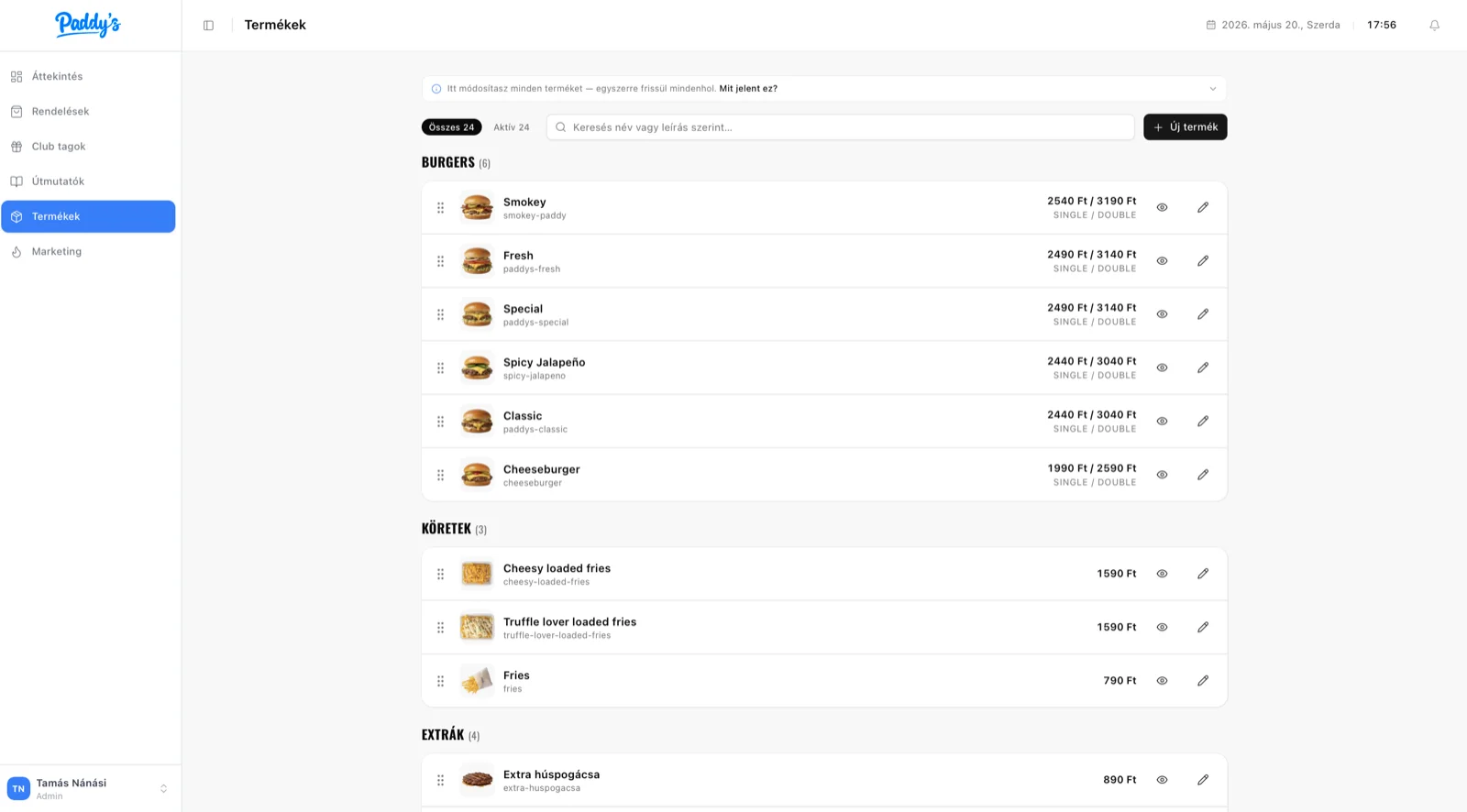
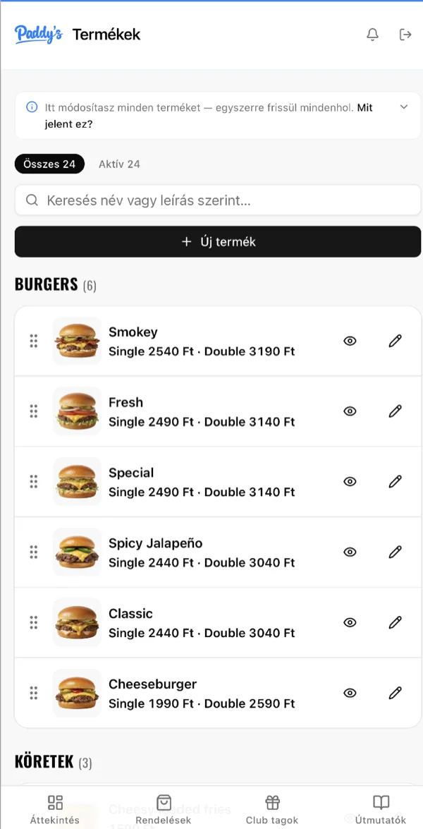
Staff dashboard
The staff dashboard solves a different problem. Customers need clarity and simplicity. The kitchen needs density and speed.
Orders flow through five states: new, accepted, preparing, ready, picked up. A sixth, cancelled state handles the exceptions. Each state is color-coded with live counts visible at a glance. The kitchen view strips away everything non-essential: large type, sticky header, live clock, oversized status pills.
Staff transition orders with a single tap. The system logs every state change with timestamps and user attribution.
Loyalty management lives in the same dashboard: customer search, QR validation, point corrections. One interface for everything the staff touches daily.
Architecture
The tech decisions came from the requirements.
Convex as the backend. The kitchen dashboard and the order tracking page both need real-time data. When a customer submits an order, the kitchen sees it instantly. When staff mark an order as ready, the tracking page updates without a refresh. A traditional REST API with polling would have added latency and complexity. Convex provides live sync, server-side mutations, scheduled jobs, and built-in rate limiting in one system.
Zustand for client-side state. The cart needs to survive page refreshes and hold complex nested data: items, variants, add-ons, deposit fees, pickup preferences. Zustand with persistence middleware handles this cleanly. Server state stays in Convex, client state stays in Zustand; the boundary between them is clean.
Next.js 16 with React 19 for the frontend. Server components handle the static parts (menu, brand pages, legal). Client components handle the interactive flows (ordering, dashboard, loyalty). This split keeps the initial bundle small while the interactive pieces load on demand.
Resend with React Email for transactional messages. Seven email types, all templated as React components, all matching the site's design language.
GSAP with lazy loading. Animation code is dynamically imported, only loads when needed. The ticker targets 60fps. Batching caps at 5 elements per trigger to prevent jank. GPU-accelerated transforms with force3D, cleaned up on completion to prevent memory leaks.
Catering
The backend is ready: pickup slots between 10:00 and 18:00, delivery details, billing, quantity-based discounts (20% from 10 servings, 30% from 40), free delivery above 50,000 HUF. Supports both delivery and pickup fulfillment.
The restaurant is finalizing the operational workflow before launch.
The invisible part
From the outside, this looks like a restaurant website with a blue color scheme and appealing food photos.
Underneath: pickup times tied to opening hours, deposit calculations per beverage, a six-state order pipeline with real-time sync, QR codes with 7-day expiration and staff-side validation, seven-step email automation, perceived progress mapping on a circular tracker, login protected by progressive lockout, and confetti that fires when you earn a free burger.
The customer sees a menu and a button. The kitchen sees exactly what they need. Everything in between is infrastructure.
There's always a next level.
If you like what you see (whether you're building a product or a team) I'd love to hear about it.